
Interior House Color Schemes: How to Choose the Right Colors for Every Room
Designing your home is like painting a picture. Every color you choose adds a piece to that masterpiece, setting the mood, creating space, and expressing your personal style. But when it comes to picking the perfect interior house color schemes, things can get tricky. With endless shades to choose from, it’s easy to feel overwhelmed. Should you go bold, or play it safe? Stick to neutrals or experiment with bright hues?
In this article, we’ll walk you through everything you need to know about selecting the right color schemes for your home. We’ll talk about color psychology, how lighting impacts your choices, and what designers are saying about the hottest color trends. We’ll also give practical tips for every room in the house because what works for the living room may not be the best choice for the bathroom.
Why Choosing the Right Color Scheme Matters
The colors you choose can change how you feel in a room. Bright, energetic colors like red and yellow can make a space feel lively, while softer, cooler tones like blue or green can help you relax. Color isn’t just a surface-level detail; it plays a role in how we think and feel. In fact, psychologists have studied the effects of color on mood and behavior for years. Research shows that colors can influence our emotions, making us feel happier, more energized, or even calm and serene.
When you walk into a well-decorated home, the colors immediately make an impact. They bring harmony, balance, and personality to your space. Get them right, and your home can feel cohesive, elegant, and even more spacious than it really is.
Understanding Color Psychology
Colors have a profound effect on our emotions and mood. Ever notice how different you feel when you’re in a brightly colored room compared to one painted in muted tones? That’s the magic of color psychology at play.
- Red: This bold color is often associated with energy and passion. It’s known to raise energy levels and is a great choice for dining rooms or living areas where you want lively conversation to flow. However, it can also be overwhelming in large doses. According to color theory, red stimulates appetite, which is why many restaurants use it.
- Blue: Blue is calming and serene, making it ideal for bedrooms or bathrooms where relaxation is key. Lighter blues can make a space feel more open and airy, while darker blues add sophistication and depth. Studies show that blue even lowers blood pressure.
- Yellow: Bright and cheerful, yellow is linked to happiness and creativity. It’s great for kitchens, home offices, or areas where you want to inspire optimism and energy. But beware: too much yellow can cause feelings of frustration.
- Green: A color closely associated with nature, green brings a sense of balance and calm to a room. Because it’s a combination of blue and yellow, it offers the best of both worlds. Green is a great choice for living rooms, bedrooms, and even kitchens.
- Gray: This neutral is highly versatile and works well in most rooms. Gray can be modern and chic when used correctly but can also feel cold if not paired with warmer accents. A soft gray works wonders in spaces that need an understated, calming backdrop.
Trends in Interior House Color Schemes
When choosing a color scheme, it’s also important to stay aware of trends—though it’s best not to follow them blindly. For instance, neutral tones have been in vogue for years, but the tide is shifting toward bolder, more personalized choices. Here’s a look at some of the top trends for 2024, according to designers.
- Earth Tones: Think warm browns, soft beiges, and deep greens. Earth tones are making a big comeback because they offer a grounding, calming effect. These colors are perfect for creating a cozy, welcoming space that feels like an escape from the fast-paced modern world.
- Moody Blues and Greens: Darker, moody colors are being used more frequently in spaces like living rooms and bedrooms. Deep shades of blue or green create a rich, luxurious feel and can make a space seem more intimate.
- Pastels: Light, airy pastels like blush pink, mint green, and baby blue are showing up in unexpected places, like kitchens and bathrooms. These colors add a playful, youthful energy to any room without being overwhelming.
- Bold Accents: If you’re hesitant to commit to a bold color on all four walls, consider using accent colors instead. Bright colors like red, orange, or emerald green can be used on a single wall, or in your furniture and decor, to add personality without overpowering the space.
- Warm Neutrals: While cool grays and blues have dominated the neutral palette for the past decade, designers are now gravitating toward warmer neutrals like beige, taupe, and terracotta. These colors add warmth and coziness to a room without making it feel too dark or overwhelming.
How to Choose the Right Color Scheme for Your Home
When it comes to choosing the right color scheme, there are a few practical things to consider.
- Lighting: One of the biggest factors in choosing a color is lighting. A room that gets lots of natural light will handle darker colors better than a room that’s mostly lit by lamps. In dimly lit spaces, lighter colors can help brighten things up.
- Room Function: The way you use a room should influence your color choices. For example, kitchens and living rooms are gathering spaces that benefit from lively, warm colors, while bedrooms and bathrooms, where you want to relax, might work better with cooler tones.
- Existing Furniture and Decor: Unless you’re planning a full makeover, your color scheme should complement the furniture and decor you already have. Consider the color of your furniture, artwork, and flooring when choosing your paint colors.
- Personal Preference: At the end of the day, your home should reflect your personal style. If you love bright, bold colors, don’t feel pressured to stick to neutrals just because they’re trendy. Your space should make you feel happy and comfortable.
Best Color Schemes for Specific Rooms
Now, let’s break down some of the best color schemes for each room in the house. Keep in mind, these are just suggestions. The most important thing is to choose colors that you love and that make you feel at home.
Living Room Color Schemes
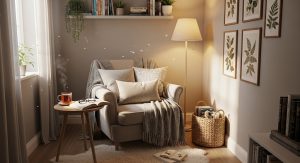
The living room is often the center of the home, where families gather to relax and entertain. It’s a space that should feel inviting and comfortable. Neutrals like soft gray, beige, or taupe are popular choices for living rooms because they provide a versatile backdrop that works with most decor styles. You can then add pops of color through your furniture, rugs, or throw pillows.
For a more modern look, consider using a deep blue or forest green as the main wall color, balanced with lighter furniture and accessories. This will create a stylish, sophisticated atmosphere.
Bedroom Color Schemes
In the bedroom, the goal is to create a peaceful retreat. Soft blues, greens, and grays work well in bedrooms because they promote relaxation and help create a calming environment. Lighter colors can make the space feel more open and airy, while darker shades add warmth and coziness.
Another trend for bedrooms is using deeper, moodier colors like navy blue or charcoal gray. Pair these colors with crisp white bedding and light wood furniture for a balanced look.
Kitchen Color Schemes
The kitchen is the heart of the home, and it’s a space where many families spend a lot of time. Warm, bright colors like yellow or red can make the kitchen feel lively and inviting, while cooler tones like blue or green can create a fresh, clean atmosphere.
For a modern look, try a two-tone color scheme with white upper cabinets and darker lower cabinets in shades of navy or charcoal. This trend adds depth and interest to your kitchen while keeping it bright and open.
Bathroom Color Schemes
Bathrooms are often small spaces, so light, bright colors work well here. White, light gray, or soft blues can make a bathroom feel clean and airy. If you want to add a touch of luxury, consider using darker, more dramatic colors like navy or black on an accent wall, paired with metallic accents and crisp white tiles.
Dining Room Color Schemes
The dining room is a great place to experiment with bolder colors. Reds and oranges stimulate the appetite and create a warm, lively atmosphere that’s perfect for dinner parties. If you prefer something more subdued, consider using rich jewel tones like emerald green or deep blue to create an elegant, formal dining space.
Related: Illuminating Interiors: Home Decor Items to Brighten Up Any Room
Home Office Color Schemes

In the home office, you want a color scheme that promotes focus and productivity. Cool colors like blue or green are great choices because they help reduce stress and create a calm, focused environment. If you’re looking for something more energizing, consider using a bright accent wall in a shade of yellow or orange to inspire creativity.
Children’s Room Color Schemes
When it comes to children’s rooms, the possibilities are endless. Bright, fun colors like yellow, pink, or teal can make the room feel playful and cheerful. But don’t shy away from more muted tones if you prefer a calming space for your child. Soft pastels like blush pink, lavender or mint green can create a soothing, restful environment.
Balancing Color with Texture and Finish
When choosing your interior house color scheme, it’s important not to focus on color alone. The texture and finish of your paint can also make a big difference. For example, a matte finish can give walls a soft, velvety appearance, while a glossy finish reflects more light and adds a bit of shine.
In high-traffic areas like the kitchen or bathroom, a semi-gloss or satin finish is a practical choice because it’s easier to clean. In bedrooms or living rooms, a flat or eggshell finish can create a more elegant, understated look.
What the Experts Say: Opinions from Top Interior Designers
When it comes to picking the right colors, interior designers have a wealth of knowledge. One common piece of advice is to avoid choosing paint colors in isolation. “Always consider the other elements in the room—like furniture, lighting, and flooring—when picking a paint color,” says designer Emily Henderson. “Color doesn’t exist in a vacuum, and the same shade can look completely different depending on the context.”
Designers also recommend testing your paint colors before committing. “Always try a sample on the wall first, and look at it at different times of day,” advises designer Nate Berkus. “Lighting can completely change how a color looks, so it’s important to see it in the space before making a decision.”
Another tip from the pros is to balance bold colors with neutrals. “If you’re going with a bold color on the walls, keep the rest of the room more neutral so it doesn’t feel overwhelming,” says designer Sarah Sherman Samuel. “You want to create a sense of balance and harmony in the space.”
The Impact of Lighting on Interior Colors
Lighting plays a crucial role in how a color looks in a room. Natural light, incandescent bulbs, and fluorescent lights can all change the appearance of your paint color.
Here’s how lighting can affect your choices:
- Natural Light: Rooms with lots of natural light can handle darker, more saturated colors. However, in rooms that don’t get much sunlight, lighter colors will help keep the space from feeling too dark or closed in.
- Incandescent Lighting: This type of lighting adds a warm, yellowish tone to your space, which can make warm colors like red or orange appear more vibrant. Cool colors like blue or green might appear more muted under this type of lighting.
- Fluorescent Lighting: Fluorescent lights tend to cast a cooler, bluish light. This can make cool colors look more vibrant but can wash out warmer tones like reds or yellows.
To get the best results, try to view your paint samples in different lighting conditions before making a final decision.
Related: Try Variations of Blue Gray Paint Colors to Elevate Your Space
Common Mistakes to Avoid When Choosing a Color Scheme
Even with all the best advice, it’s easy to make mistakes when choosing a color scheme for your home.
Here are some of the most common pitfalls and how to avoid them:
- Choosing Colors Without Testing: One of the biggest mistakes people make is picking a color based on a small paint swatch. Always test your colors on the wall first to see how they look in different lighting conditions.
- Ignoring Undertones: Every color has an undertone, whether it’s warm, cool, or neutral. For example, gray can have a blue, green, or purple undertone, which can completely change how it looks in your space. Be sure to consider the undertones of your paint colors and how they’ll work with your decor.
- Going Too Bold: While bold colors can make a statement, they can also be overwhelming if used in excess. If you’re drawn to bright or dark colors, try using them as accent colors rather than painting all four walls.
- Not Considering the Rest of Your Home: It’s important to think about how your color scheme will flow with the rest of your home. Rooms that are visible from one another should have complementary color schemes to create a sense of cohesion.
Conclusion
Choosing the right interior house color schemes can make a world of difference in how your home feels and functions. Whether you’re drawn to bold, bright colors or prefer a more neutral palette, the key is to find a balance that works for you and your space. By considering factors like lighting, room function, and personal preference, you can create a home that not only looks beautiful but feels like a true reflection of your style.


Post Comment